Starting this new project! I need to do some research into "Pottery", my client is a pottery place in Nottingham called " Hands On Pottery", I use to do "Pottery" in may spare time long time ago! I also completed my Level 2 and Level 3 in "Pottery".
I have found out some pottery website which they are also based in Nottingham, I will look into them and see if i could get an good idea that i can start create something good and nice.
This first website I came across is called "Razzle Dazzle Pots", I think it is a very nice good looking website, it suits for this kind of business but i think there is too much information and text, it is like reading the "Daily Telegraph", it has too much text i think they should go over it again and take some things out that are not very important. colour wise i think it does not look bad. font and layer wise needs some work on it.
This is a screen shoot of the website.
The URL link: http://www.razzledazzlepots.co.uk/Razzle_Dazzle/Welcome.html
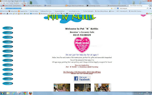
This is the second website that i have found, It is called "Pot-N-Kettle", it is a very boring and $#@T website, I don't know what to say about it it looks so bad!
This is a screen shoot of the website.
The URL link: http://www.pot-n-kettle.com/index.php
This is my third website I came across which is called "Guy Routledge Ceramics", I think that this website was made in like 1 day because everything is in one page and there is too much going on in one page, colour wise is very bad it has a black background with white font colour this is very bad! Layout wise is very bad too it has too much information on one page! It needs a lot of improvements!
This is a screen shoot of the website.
The URL link: http://www.guyroutledgeceramics.com/
This is my forth website that i have found, it's called "Buzz Ceramics", I think this website is the best out of all of theses above, this website straightaway stands out, it is a very modern stylish good looking website, I can only suggest that they should try to aim it more on "Pottery and Ceramics" i think it looks like a very business and professional website rather than a artist website! also they should have a "Mobilized" or a "Responsive" website this will be really great for their business.
This is a screen shoot of the website.
The URL link: http://www.buzzceramics.co.uk/index.html


No comments:
Post a Comment