Friday, 22 February 2013
Google Fonts
Just had a look at Google Fonts for some fonts for my website, These are few fonts that i really like and i will use one or two of them.
The Apple.com navigation menu created using only CSS3
http://www.marcofolio.net/css/the_apple.com_navigation_menu_created_using_only_css3.html
http://www.smashingapps.com/2012/03/14/40-excellent-css3-menu-tutorials.html
http://phonegap.com/
http://buildmobile.com/build-intuitive-extensible-menus-in-android-with-java-and-xml-2/
http://buildmobile.com/responsive-web-design-grid-layouts/
http://www.smashingapps.com/2012/03/14/40-excellent-css3-menu-tutorials.html
http://phonegap.com/
http://buildmobile.com/build-intuitive-extensible-menus-in-android-with-java-and-xml-2/
http://buildmobile.com/responsive-web-design-grid-layouts/
Second Wednesday Nottingham
This week 3 of us went to the second wednesday event in the antanna, it was a really great evening the talk was about APP's which i am really intrested in so this was a really good event that i went to.
The guy that was talking about APP's was called: Matt Woodfield.
The guy that was talking about APP's was called: Matt Woodfield.
New Background colour
My client has sent me a image so that i can use the paint and pick tool in Photoshop so that i can use the same colour as the i,age for the website!
I have just did a simple test to see how it looks!
This is the image the sent to me:
This is my test in Photoshop:
I have just did a simple test to see how it looks!
This is the image the sent to me:
This is my test in Photoshop:
New Logo From client
My client has decided to make their own logo!!! after wasting my time make logos fro them they came up to me and said that they want to make the own logo! so i said ok you guys want to make your own logo then make it for me! they made the logo and they send it to me via email and this is how it looks.
"The New Logo!"
I am not sure what to say about this, but this is what my client wants on that amazing website that i will be designing for them!.
"The New Logo!"
Tuesday, 19 February 2013
Client project
After doing few design for my client, they have juts informed me that they want to change there design!!!!!
they would like to have another color for the background.
A new logo that they have provided the font and they only want that font, style and colors to be on there logo! They don't understand anything i tell them!
This is the color they have chosen:
This is the Logo/font they have give me to use for them!
Friday, 15 February 2013
HTML5 and CSS3 Menus
http://diveintohtml5.info/index.html
http://html.adobe.com/edge/webfonts/
http://tympanus.net/Tutorials/SlideDownBoxMenu/
http://www.noupe.com/css/100-great-css-menu-tutorials.html
http://webdesign.tutsplus.com/tutorials/site-elements/how-to-create-a-modern-ribbon-banner-navigation-bar-with-pure-htmlcss3/
http://insicdesigns.com/demo/css3/exp2/index.html
http://www.cssplay.co.uk/menus/
http://html5demos.com/
http://html5demos.com/geo
http://www.w3schools.com/html/html5_geolocation.asp
http://www.tinymce.com/index.php
http://ginva.com/2011/12/css3-generator/
http://topics.udm4.com/online_chat_box_maker/
Tuesday, 12 February 2013
My layout of my client website!
These are a draft/sample layouts to show my client how will the website will look like, not sure what will there request be upon these layouts.
Home page:
About Us Page:
Classes page:
Gallery Page:
Shop Section Page:
Contact Us Page:
Home page:
About Us Page:
Classes page:
Gallery Page:
Shop Section Page:
Contact Us Page:
Saturday, 9 February 2013
Tuesday, 5 February 2013
Research
Starting this new project! I need to do some research into "Pottery", my client is a pottery place in Nottingham called " Hands On Pottery", I use to do "Pottery" in may spare time long time ago! I also completed my Level 2 and Level 3 in "Pottery".
I have found out some pottery website which they are also based in Nottingham, I will look into them and see if i could get an good idea that i can start create something good and nice.
This first website I came across is called "Razzle Dazzle Pots", I think it is a very nice good looking website, it suits for this kind of business but i think there is too much information and text, it is like reading the "Daily Telegraph", it has too much text i think they should go over it again and take some things out that are not very important. colour wise i think it does not look bad. font and layer wise needs some work on it.
This is a screen shoot of the website.
The URL link: http://www.razzledazzlepots.co.uk/Razzle_Dazzle/Welcome.html
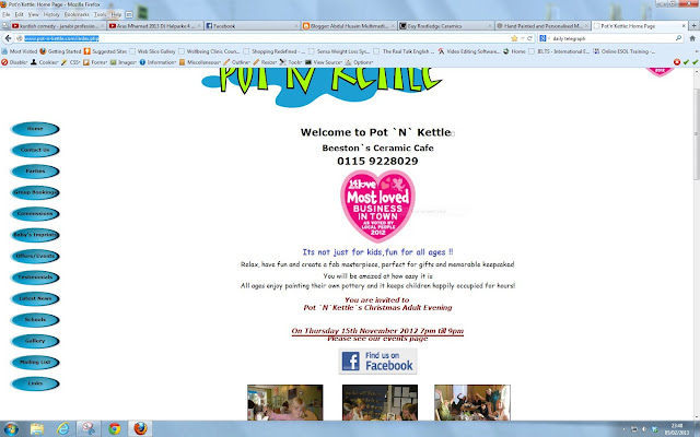
This is the second website that i have found, It is called "Pot-N-Kettle", it is a very boring and $#@T website, I don't know what to say about it it looks so bad!
This is a screen shoot of the website.
The URL link: http://www.pot-n-kettle.com/index.php
This is my third website I came across which is called "Guy Routledge Ceramics", I think that this website was made in like 1 day because everything is in one page and there is too much going on in one page, colour wise is very bad it has a black background with white font colour this is very bad! Layout wise is very bad too it has too much information on one page! It needs a lot of improvements!
This is a screen shoot of the website.
The URL link: http://www.guyroutledgeceramics.com/
This is my forth website that i have found, it's called "Buzz Ceramics", I think this website is the best out of all of theses above, this website straightaway stands out, it is a very modern stylish good looking website, I can only suggest that they should try to aim it more on "Pottery and Ceramics" i think it looks like a very business and professional website rather than a artist website! also they should have a "Mobilized" or a "Responsive" website this will be really great for their business.
This is a screen shoot of the website.
The URL link: http://www.buzzceramics.co.uk/index.html
1 st meeting
This is a little proof of my 1st meeting with my client as what we have decided to do and what i will be doing for them and what they will have to do..
Friday, 1 February 2013
Client project
I have started doing some work on my client project, my client is Hands On Pottery which is based in Nottingham, I have re-designed their logo because they really did not have a nice logo.
This is the cornet logo:
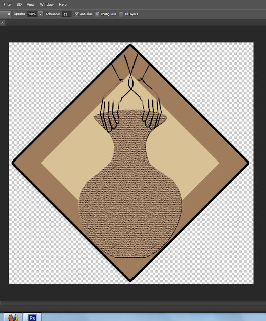
So i came up with a new fresh logo which will be more appealing and modern.
Theses are few logos that i have made.
This is the cornet logo:
So i came up with a new fresh logo which will be more appealing and modern.
Theses are few logos that i have made.
Subscribe to:
Comments (Atom)


